Most feedback isn’t wrong. It’s just hard to use. “Can it pop more?” “Something feels off.” “I’ll know it when I see it.” Each of those notes costs the designer a guess, and every guess costs the project a round.
Good feedback is a skill, and it can be learned. It comes down to a few habits you can use on the next file someone sends you.
Start with what the work is for
Before commenting on anything, remind yourself what the piece is meant to do. A landing page exists to get sign-ups. A poster exists to be noticed from across a room. A pitch deck exists to get a second meeting.
When your notes are tied to that goal, they stop being matters of taste. “The headline is too small” is an opinion. “I didn’t notice the headline until I’d scrolled past the pricing” is evidence about whether the page does its job.
Describe the problem, not your solution
It’s tempting to write the fix: “Make the button red.” But you’re usually better placed to describe what went wrong than to decide how to solve it. The designer knows the system, the constraints and the ten options you haven’t seen.
Try this pattern instead:
- What I noticed: “I missed the Book a demo button on my first look.”
- Why it matters: “It’s the main thing we want people to do.”
- An idea, if you have one: “Could it stand out more from the secondary links?”
The idea is optional. The first two parts are not.
A good note tells the designer what happened to you as a viewer. The designer can take it from there.
Point at the exact spot
“The top section feels crowded” can mean the navigation, the hero, the headline or the spacing between them. Every ambiguity is a chance for the designer to fix the wrong thing.
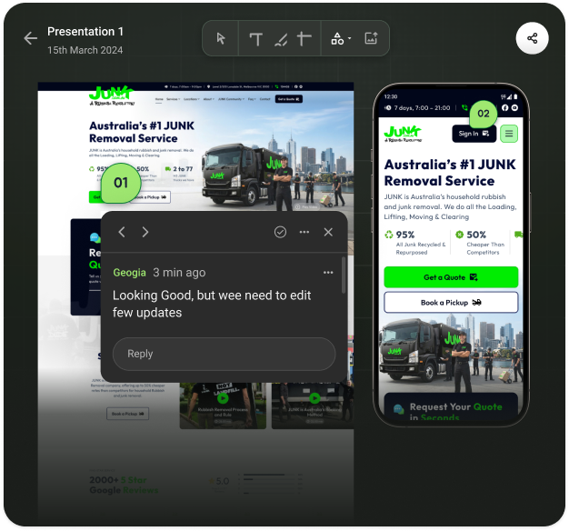
Put your comment directly on the element you mean. If your note is about the gap between two things, say so. If it applies to every page, say that too, once, instead of repeating it on each one.
Separate must-haves from nice-to-haves
Not every note has the same weight, and the designer can’t read your mind about which ones matter most. Label them:
- Blocking. Wrong information, broken layouts, anything that stops launch.
- Important. Changes that would clearly make the work better.
- Optional. Personal preferences and small ideas. Take them or leave them.
That one-word label saves a surprising amount of back-and-forth, and it gives the designer permission to push back on the optional ones.
Say what’s working
Positive feedback isn’t just politeness. It’s information. If you don’t say the typography is great, it might not survive the next round of changes. A single line such as “the photography direction is exactly right, keep it” protects the parts you’d hate to lose.
Review in one pass, with one voice
Feedback that trickles in over three days, from four people who disagree, is the hardest kind to act on. Where you can:
- Give everyone the same deadline for the round.
- Keep all comments in one place, on the file itself.
- Settle disagreements between reviewers before they reach the designer.
A quick template
When in doubt, write each comment like this:
“On [this exact spot], I noticed [what happened]. That matters because [the goal]. [Optional idea.] Priority: [blocking, important or optional].”
It feels formal the first few times. After a week it becomes habit, and your designers will notice.
If you want to see how this works in practice, CommentJet reviews let you pin each comment to the exact spot on a design, image or PDF, reply in a thread and mark it resolved once it’s done. For the other side of the table, read how to take feedback without taking it personally.
Leave a Reply